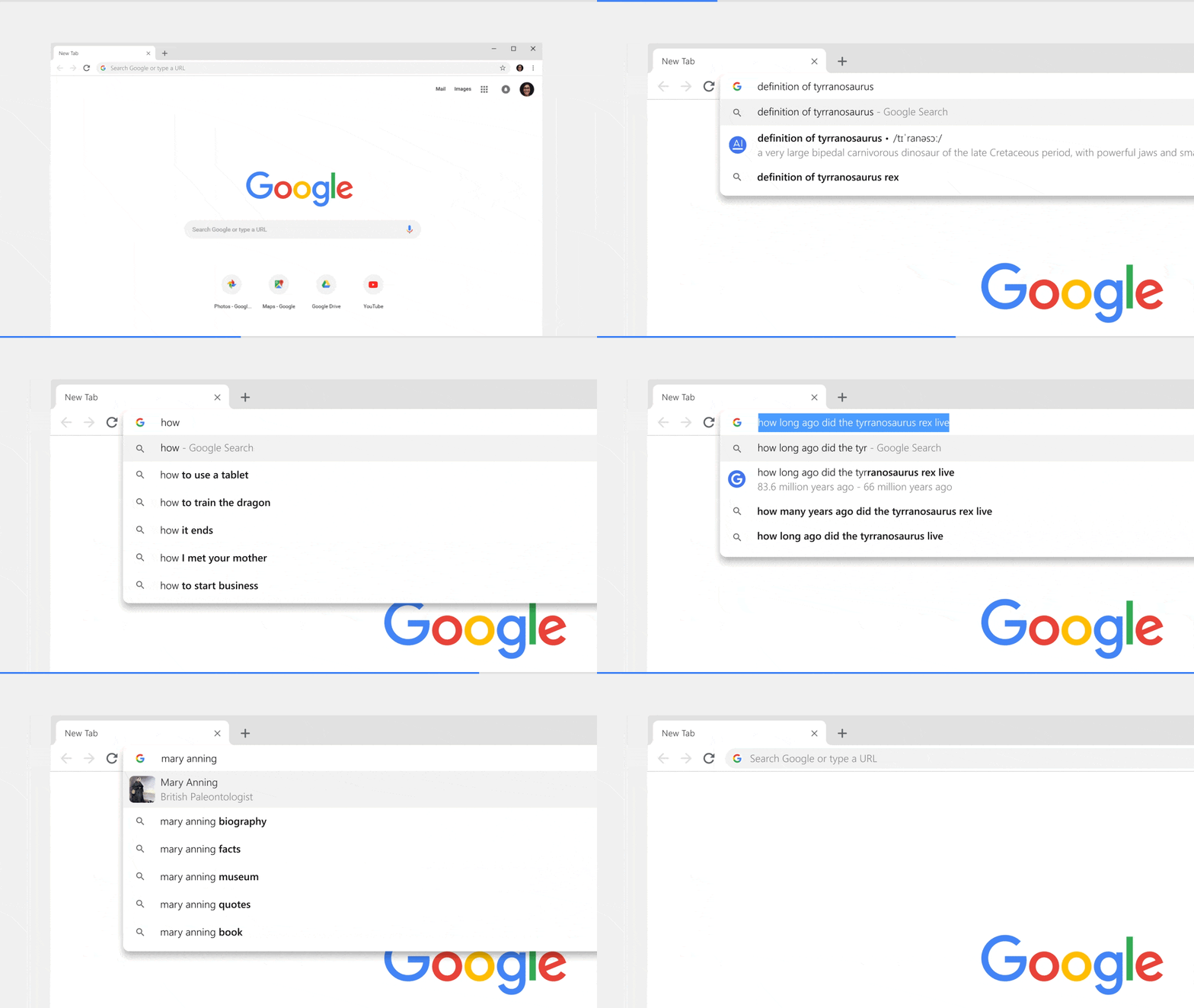
As Google recently marked its 10th birthday (September 2nd, to be exact) and keeping that as the frontline, Google unveiled a major redesign of its web browser – Google Chrome 69. This update brings in a new Material Design theme.
ALSO READ: Samsung Teases Foldable Smartphone Launching Later This Year!
Chrome 69 Glorified With Material Design
The updated Chrome 69 ditches trapezoidal tabs and brought in Material like rounded tabs and a white appearance. These changes make web icons easier to see when there are loads of tabs open. Menus, prompts, and addresses are also much simpler, and the toolbar is now on the bottom for iOS users to make it easier to reach.

Not just that, the update for Android enables the Modern Design flag that has been mostly-finished for months. Interestingly, the iOS app now has the address bar on the bottom of the screen, just like the ‘Chrome Home’ UI that was in development for a year on Android but ultimately canceled.
ALSO READ: Google Relies On Physical Keys For Its Own Employee’s Online Security!
Furthermore, the address bar now displays answers as you type letting you select what you’re looking for even without loading a search result. The New Tab Page can now be personalized with custom backgrounds and shortcuts.

In addition to that, the Chrome 69 features password management with built-in password generation, improved autofill, and a ‘Switch to tab’ button if you try to visit a page you already have open. Well, this new updated Chrome 69 start rolling out for the desktop platform and for Android in the coming days.
BONUS VIDEO
For the latest tech news, follow TechDipper on Twitter, Facebook, Google+, Instagram and subscribe to our YouTube channel.


