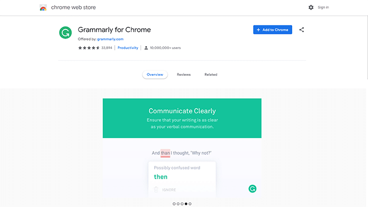
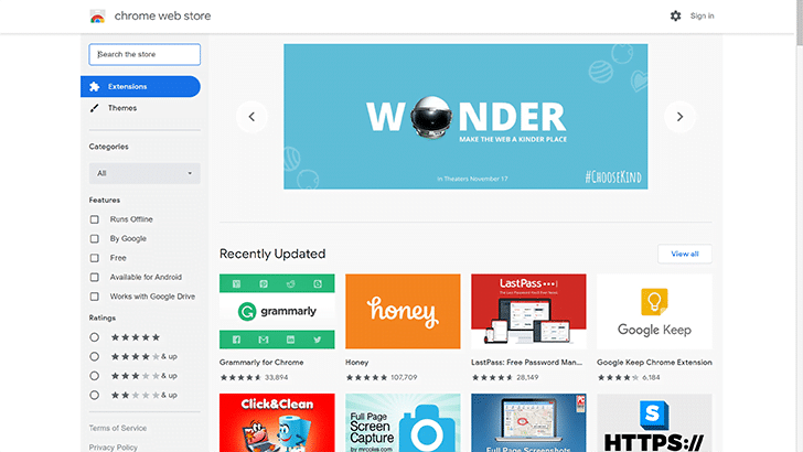
Google has recently updated its web browser with Material Design theme, with the release of Chrome 69. Well, now it’s time for Chrome Web Store to get a makeover, apparently matching the new look of Chrome.
ALSO READ: Google Redesigns Google Chrome 69 With Material Theme; Thank Google’s 10th Anniversary!
Chrome’s Web Store Get Material Makeover
Thanks to the sketch extension developers, the Web Store looks sleek and professional, which gives out a confidence in the store’s extensions. There’s a lot of white space and rounded edges.

It provides a clean canvas that allows the colorful extension thumbnails to pop. Well, you like it or not, this Material Design makes a lot of sense in a digital storefront. This update comes after recent Material updates of Contacts, Phone, and Google Search on desktop.
ALSO READ: 5 Best Chrome Extensions For Productivity In 2018; Get More Work Done!
Google is not stopping here for sure, unless this informally known Material 2.0 hits all its apps and services. Apart from the white theme, we expect to see a dark theme around soon. Hope is the key.
BONUS VIDEO
For the latest tech news, follow TechDipper on Twitter, Facebook, Google+, Instagram and subscribe to our YouTube channel.


