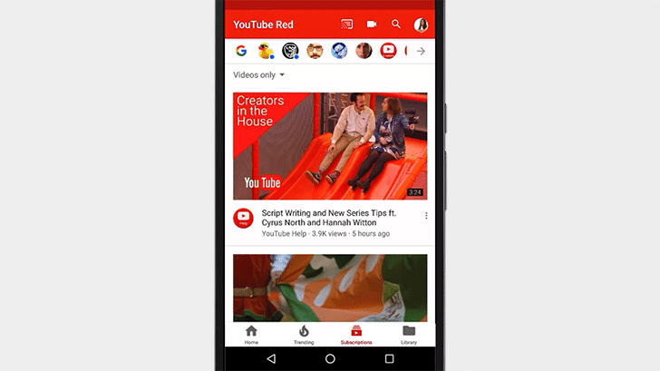
YouTube began testing a new layout with a bottom navigation UI back in September, last year. From past few months, it has started pushing out updates for users on Android, of course with minor tweaking and fixing issues. Well, YouTube has officially unveiled the new design.
ALSO READ: Swachh Bharat App Launched; Allows Users To Report Garbage!
YouTube’s New Bottom Navigation UI
The new version of YouTube should make it easier for users to navigate through the menu, thanks to the new layout. Speaking of layout, the new layout ditches the large top navigation bar to bring out a smaller top bar with few buttons and a bottom navigation UI.

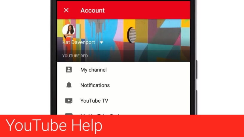
The upload button has moved from the floating action button to the top bar and a profile icon replaces the overflow menu. The account tab has been renamed Library in which your likes, favorites, uploads and playlists are placed, while account and settings tabs have been relocated from the profile icon at the top.
ALSO READ: Samsung Releases SoundAssistant App For Galaxy Phones; Download!
[button color=”success” size=”large” type=”round” target=”_blank” link=”https://play.google.com/store/apps/details?id=com.google.android.youtube&hl=en”]Download Via Play Store[/button] [button color=”success” size=”large” type=”round” target=”_blank” link=”https://itunes.apple.com/in/app/youtube-watch-videos-music-and-live-clips/id544007664?mt=8″]Download Via App Store[/button]
For the latest tech news, follow TechDipper on Twitter, Facebook, Google+ and subscribe to our YouTube channel.


