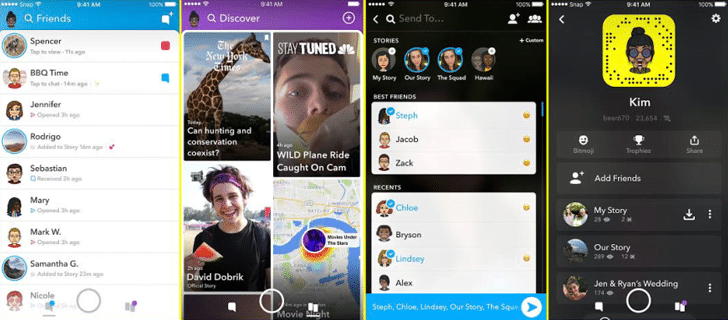
Snapchat redesigned, it was necessary as the Snapchat app has always been tough to understand or use, moreover it always showed a lag-fest on Android devices. So, today the company announced an updated and redesigned version of its app.
ALSO READ: Facebook Messenger Testing Snapchat Like Streaks Feature!
Snapchat Redesigned Interface
Well, if you’re not familiar with the (old) Snapchat app design; when you open the app, you will direct come to the camera page, from where you can snap to share with your friends. When you left swipe, you will see a list of friends to whom you have chatted or sent the snap. When you swipe right from the camera page, you will see your friend’s Stories and variety of sponsored posts.

The redesign of the app will bring Stories of your friends to the left side and the right side screen is fully occupied by the sponsored post and content from publishers. The company brought back the auto-advance feature and the Stories are now sorted based on a new ‘best friends’ algorithm.
ALSO READ: Instagram Is Secretly Testing Handful Of Features; There Are A Lot!
Evan Spiegel, CEO, Snapchat, said;
There is a strong likelihood that the redesign of our application will be disruptive to our business in the short term, and we don’t yet know how the behavior of our community will change when they begin to use our updated application. We’re willing to take that risk for what we believe are substantial long-term benefits to our business.
For the latest tech news, follow TechDipper on Twitter, Facebook, Google+, Instagram and subscribe to our YouTube channel.


